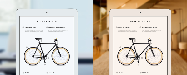
Shortly after Apple announced the new 9.7-inch iPad Pro, I wrote a very quick take on the new True Tone display feature. True Tone automatically adjusts the color temperature of the iPad’s screen to complement the ambient light of your surroundings. For example, have you ever been in a room with warm light and checked email on an iPad, only to lose your eyeballs from the cool-bright burst of light? (Maybe I exaggerate…) True Tone is the answer to that.
However, my initial reaction as a photographer was wariness. If the color of the screen is changing depending on my environment, how can I do any sort of accurate editing? I confirmed that this will be a setting that can be turned off. And I continue to wait until I can get my hands on a device and test it out.
Well, True Tone turns out to be a lot more interesting. Developer Craig Hockenberry noted that the expanded color gamut of the 9.7-inch iPad Pro is just the beginning:
In order to make the effect work, iOS needs color management. And with iOS 9.3, that capability is now here—and open for other developers to work with:
The Open Radar report Craig created notes that iOS 9.3 now supports ColorSync, the technology found in OS X for managing color profiles.
Additionally, starting with iOS 9.3 ColorSync support was added to UIKit.
I’ve noticed that it works correctly for both UIColor in a UILabel and with a UIImage in a UIImageView. Are there any other places where ICC profiles are used?
In a conversation with Apple engineers, I also learned that some older devices do not match color. That’s fine, but devices should be listed so our apps can adapt gracefully to this situation.
Why is color management important? Until now, every iOS device ships with just one color profile, sRGB, which is a good general color space for drawing color on screens. The problem is that not all screens are built the same: the photo you view on your laptop may look different on a desktop monitor, which may look different still on a mobile device. Color management is a way to adjust each of those screens so that the image you’re working on remains consistent.
Apple’s screens are generally very good, but for photographers and other visual artists and designers, the inability to adjust the color profile has meant that the iPad is excluded from any serious image-processing workflows.
Now, with true color management possible on the iPad Pro, the tablet may find a place in that chain, and perhaps photographers will be able to do final adjustment work on an iPad instead of bringing a laptop.
We’ll see when the 9.7-inch iPad Pro begins to ship. As Craig notes in his report, it’s not clear whether this capability extends to other hardware or if this iPad Pro is the only one. But with a ColorSync foundation in iOS, it puts more “Pro” into iPad Pro.
If you like the work I do, please consider signing up for my low-volume newsletter that I use to announce new projects, items, and giveaways that I think my readers would be interested in.

Captivating discovery Jeff. Calibration questions and profiling aside, I have to wonder how a constantly-shifting color space will change how we make images that are consumed on iPads. It’s one thing to be sure the image is true when you make it, a whole other thing when it’s warmed up upon delivery.
So, for some time already iOS devices could adjust their screens’ brightness in accordance with the ambient brightness of the illuminant. They claim the iPad pro will adjust its screen’s color temperature in accordance with the ambient color of the illuminant (second dimension). Care to check whether the iPad pro will also adjust its screen’s color along the third dimension, orthogonal to the Plack locus (roughly, the green-magenta line)?